✽ Rhys Webber
Registration -> Verification
Registration -> Verification
Registration -> Verification

At Student Beans, we were exploring how we could increase our Signup → Verification conversion rate. To start, we put out a Survicate survey on the verification flow looking to get an insight into why users weren't verifying. The results showed us that around 30% of users were not aware that they were going to have to verify. Verification is a big part of the flow, and we want users to be aware that they're required to do it.

The Data team then put together a dashboard for us, when looking at the last interaction the user made before dropping off, around 97% of users did not interact at all. This gave us more of an insight into how many none students were truly attempting to sign up; we believe a lot of the 97% would be none students, they were trying to see if they could sign up.

In the current flow, there's no mention of the user having to verify their account. We believed this to be negatively impacting our KR of 'Increase 24hr registration to verification conversion rate from 69% to 80%'. If users are not aware that they are going to have to verify, when they come to it the flow might feel too long and they just drop off. Also, none students could be attempting to sign up, they weren't aware that we require users to verify their educational status.With the problem defined, this is how I approached it.

We have 2 user stories for this problem. Firstly, there's Nigel, he's not a student and he's after some sneaky savings. Next, there's Susan, she is a student who's trying to get some honest savings.

In order to improve their experience using Student Beans, we want to better inform Nigel & Susan what to expect before they try to register with us.

We came together as a squad and listed off some ideas as to how we could solve the problem, the solutions ranged from a simple checkbox to swapping the order of the flow and asking users to verify before registering. I then explored 4 solutions.
Option A was changing the button copy. This had no disruption to the user flow but I had little confidence that users would properly read the button.
Option B was adding in a tile explaining the flow and that you have to be a student to use our service. Users would then understand that they can't use Student Beans if they're not a student, and if they are a student they're going to have to verify that. However, how many would read this with the form just to the right?
Option C was a screener question asking whether the user is a student or not while explaining that they would have to verify. This disrupts the user flow, however forces the user into deciding if they want to lie to us or not.
Option D was a checkbox which the user would have to check to confirm they're a student in full time education. This is minimal disruption to the flow again, but how many users would check it out of habit & without reading the text, especially if they notice it's a required field.

Based on the hypothesis of:
"We believe that prompting users to confirm they're a student will ensure only students try to register"
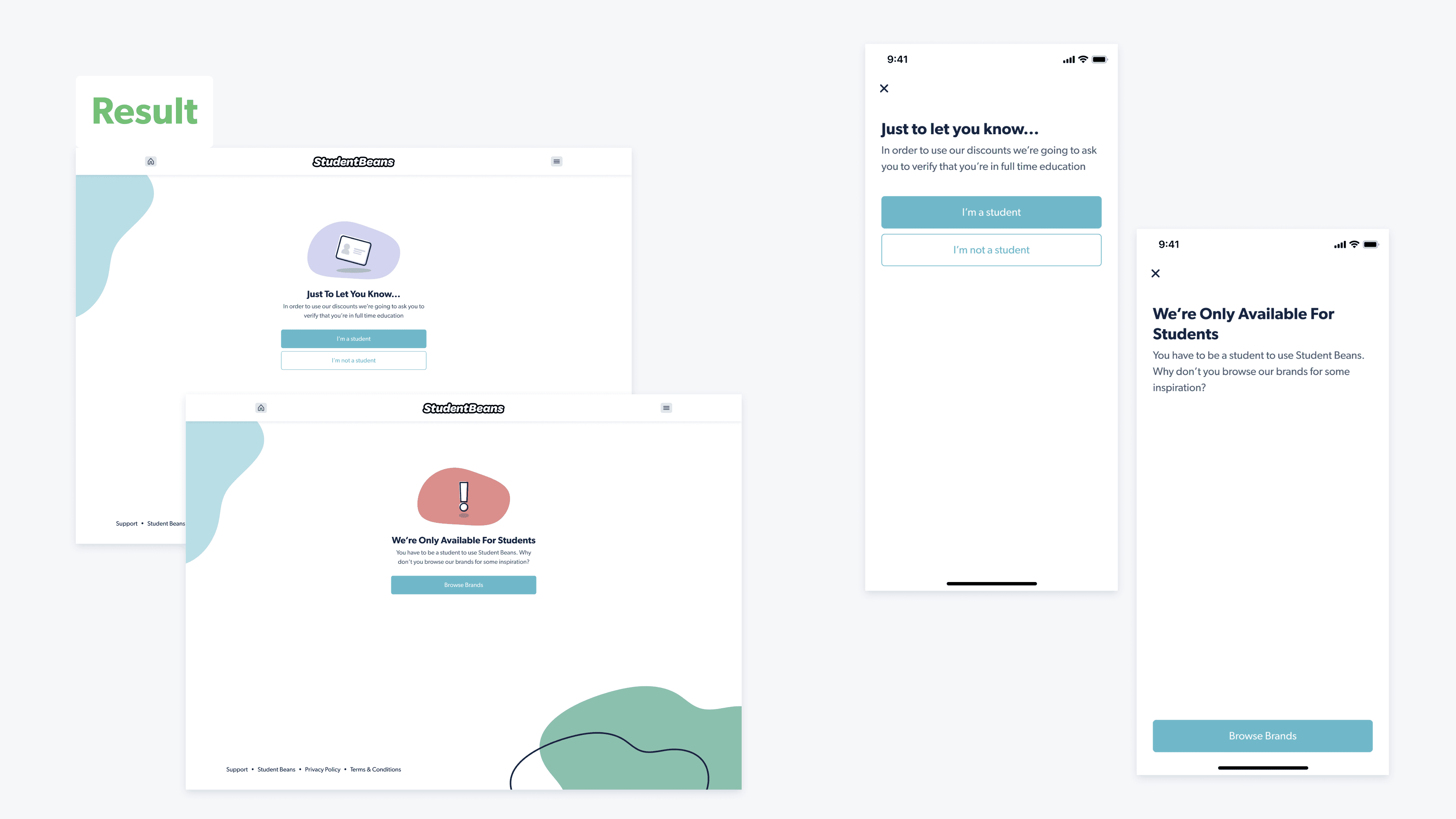
I decided to go with option C and further refined it. After making the design 'pop' the final screen can be seen above. We let users know that they're going to have to verify their student status, and they are then made to select whether they're a student or not.
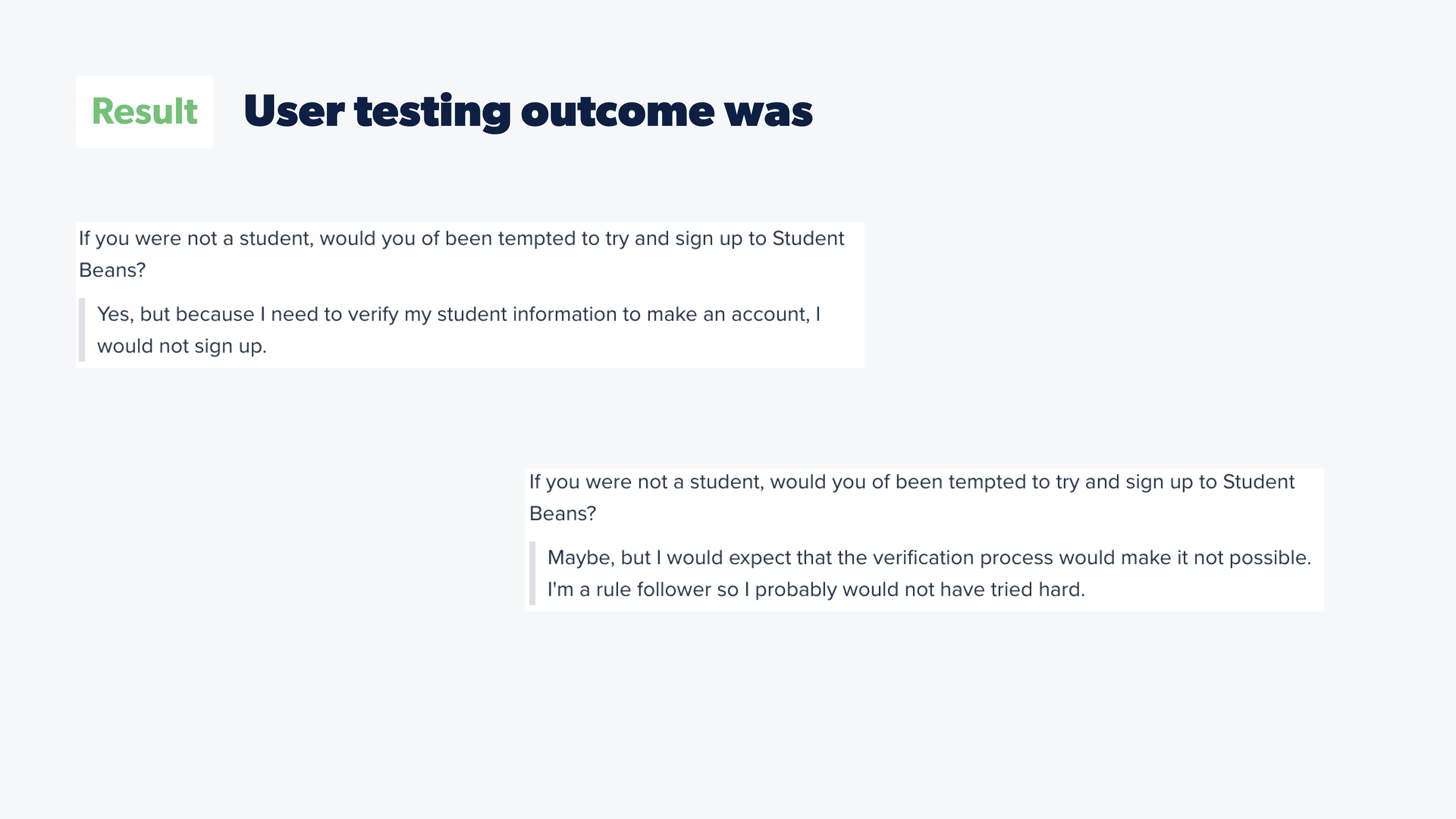
I ran the screen through user testing with the aim to find out general thoughts on the page, and if the copy explains what the user was going to have to do. All of the users understood what the page was explaining. At the end of the test, the users were asking if they were not a student, would they of been tempted to sign up to student beans. The 2 answers which stood out are shown above. Both of these users were not students & reference the fact that they wouldn't sign up because of the verification process. Verification was only mentioned on the new screen, there were no other screens mentioning verification in the prototype. Testing was a success.
Above, you can see the final designs for the experiment. The designs for web on the left & apps on the right.
At Student Beans, we were exploring how we could increase our Signup → Verification conversion rate. To start, we put out a Survicate survey on the verification flow looking to get an insight into why users weren't verifying. The results showed us that around 30% of users were not aware that they were going to have to verify. Verification is a big part of the flow, and we want users to be aware that they're required to do it.
The Data team then put together a dashboard for us, when looking at the last interaction the user made before dropping off, around 97% of users did not interact at all. This gave us more of an insight into how many none students were truly attempting to sign up; we believe a lot of the 97% would be none students, they were trying to see if they could sign up.
In the current flow, there's no mention of the user having to verify their account. We believed this to be negatively impacting our KR of 'Increase 24hr registration to verification conversion rate from 69% to 80%'. If users are not aware that they are going to have to verify, when they come to it the flow might feel too long and they just drop off. Also, none students could be attempting to sign up, they weren't aware that we require users to verify their educational status.With the problem defined, this is how I approached it.
We have 2 user stories for this problem. Firstly, there's Nigel, he's not a student and he's after some sneaky savings. Next, there's Susan, she is a student who's trying to get some honest savings.
In order to improve their experience using Student Beans, we want to better inform Nigel & Susan what to expect before they try to register with us.
We came together as a squad and listed off some ideas as to how we could solve the problem, the solutions ranged from a simple checkbox to swapping the order of the flow and asking users to verify before registering. I then explored 4 solutions.
Option A was changing the button copy. This had no disruption to the user flow but I had little confidence that users would properly read the button.
Option B was adding in a tile explaining the flow and that you have to be a student to use our service. Users would then understand that they can't use Student Beans if they're not a student, and if they are a student they're going to have to verify that. However, how many would read this with the form just to the right?
Option C was a screener question asking whether the user is a student or not while explaining that they would have to verify. This disrupts the user flow, however forces the user into deciding if they want to lie to us or not.
Option D was a checkbox which the user would have to check to confirm they're a student in full time education. This is minimal disruption to the flow again, but how many users would check it out of habit & without reading the text, especially if they notice it's a required field.
Based on the hypothesis of:
"We believe that prompting users to confirm they're a student will ensure only students try to register"
I decided to go with option C and further refined it. After making the design 'pop' the final screen can be seen above. We let users know that they're going to have to verify their student status, and they are then made to select whether they're a student or not.
I ran the screen through user testing with the aim to find out general thoughts on the page, and if the copy explains what the user was going to have to do. All of the users understood what the page was explaining. At the end of the test, the users were asking if they were not a student, would they of been tempted to sign up to student beans. The 2 answers which stood out are shown above. Both of these users were not students & reference the fact that they wouldn't sign up because of the verification process. Verification was only mentioned on the new screen, there were no other screens mentioning verification in the prototype. Testing was a success.
Above, you can see the final designs for the experiment. The designs for web on the left & apps on the right.
Product Design Native App Design Research & Testing
Product Design Native App Design Research & Testing
Product Design Native App Design Research & Testing