✽ Rhys Webber
CMS Improvements
CMS Improvements
CMS Improvements
Ease of use is always my top priority, this doesn't of course stop at consumer facing products! Internal tools can sometimes be looked over when it comes down to user experience, corners can be cut in order to get the consumer products working. With the launch of the Student Beans internal CMS, the operations team were reporting some issues they were encountering. To ensure the team had the best possible experience, we launched an NPS survey to track their issues & confidence in the tool.

I used an NPS survey to gather user feedback as it was a quick & easy way to identify problems. The survey also gave us a metric which the team could use to see our impact and also report to the leadership team. After analysing the results, we had a list of problems which were impacting their work & needed to be solved. Solving these issues would free up engineering resource and allow us to finish refactoring the CMS.

The first problem we tackled was that the team didn't know which flag corresponded to which country. When the tool first launched, we were live in a lot less countries. Introducing a tooltip on hover meant the team didn't require a geography degree to perform simple tasks.
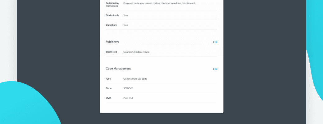
The team were also having issues viewing information about codes for offers. With more brands being added to the site, it was getting difficult to identify offers. The team would use the code type not only to identify similar offers, but also troubleshoot any errors encountered. We introduced a code management section to the view modal which was more suitable for their needs. From the offers index, the team could quickly retract key information with just 1 click on the same page, rather than having to open different sections within other pages.
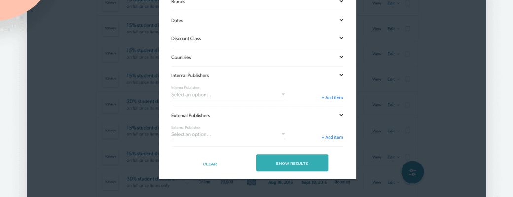
Having similar offers live on different platforms (we call them publishers) was causing confusion for the team. Because of the way the system was built, we could often end up with multiple identical offers. Similar to the previous problem, the team would have to click into further pages, and then toggle different sections to find out simple information. Returning to the index page, it could then get confusing as to which offer you just checked being as they're all identical. By allowing the team to filter the index page by publisher, they could easily identify which offer they were looking for.
In the 3 months since we first sent out the survey, we saw an increase in confidence by 125%. The amount of issues the team were reporting to engineering also decreased and allowed them to carry on with remaining work for the refactor.
Ease of use is always my top priority, this doesn't of course stop at consumer facing products! Internal tools can sometimes be looked over when it comes down to user experience, corners can be cut in order to get the consumer products working. With the launch of the Student Beans internal CMS, the operations team were reporting some issues they were encountering. To ensure the team had the best possible experience, we launched an NPS survey to track their issues & confidence in the tool.
I used an NPS survey to gather user feedback as it was a quick & easy way to identify problems. The survey also gave us a metric which the team could use to see our impact and also report to the leadership team. After analysing the results, we had a list of problems which were impacting their work & needed to be solved. Solving these issues would free up engineering resource and allow us to finish refactoring the CMS.
The first problem we tackled was that the team didn't know which flag corresponded to which country. When the tool first launched, we were live in a lot less countries. Introducing a tooltip on hover meant the team didn't require a geography degree to perform simple tasks.
The team were also having issues viewing information about codes for offers. With more brands being added to the site, it was getting difficult to identify offers. The team would use the code type not only to identify similar offers, but also troubleshoot any errors encountered. We introduced a code management section to the view modal which was more suitable for their needs. From the offers index, the team could quickly retract key information with just 1 click on the same page, rather than having to open different sections within other pages.
Having similar offers live on different platforms (we call them publishers) was causing confusion for the team. Because of the way the system was built, we could often end up with multiple identical offers. Similar to the previous problem, the team would have to click into further pages, and then toggle different sections to find out simple information. Returning to the index page, it could then get confusing as to which offer you just checked being as they're all identical. By allowing the team to filter the index page by publisher, they could easily identify which offer they were looking for.
In the 3 months since we first sent out the survey, we saw an increase in confidence by 125%. The amount of issues the team were reporting to engineering also decreased and allowed them to carry on with remaining work for the refactor.
Product Design User Research User Testing
Product Design User Research User Testing
Product Design User Research User Testing